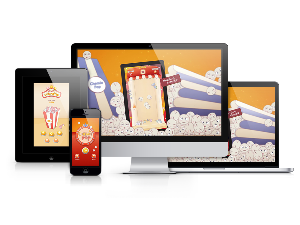
A web game App that turns chemical element's property - atomic number into an interactive game.
A web game App that turns chemical element's property - atomic number into an interactive game.
The idea came from the time I taught Chemistry at an educational organization, where I found that students are lack of interest when it comes to school subjects, which equal to boredness and stress. In order to enhance students' interest in Chemistry, I built Chemie Pop to transform the learning process and to achieve the ideation - learning while playing!
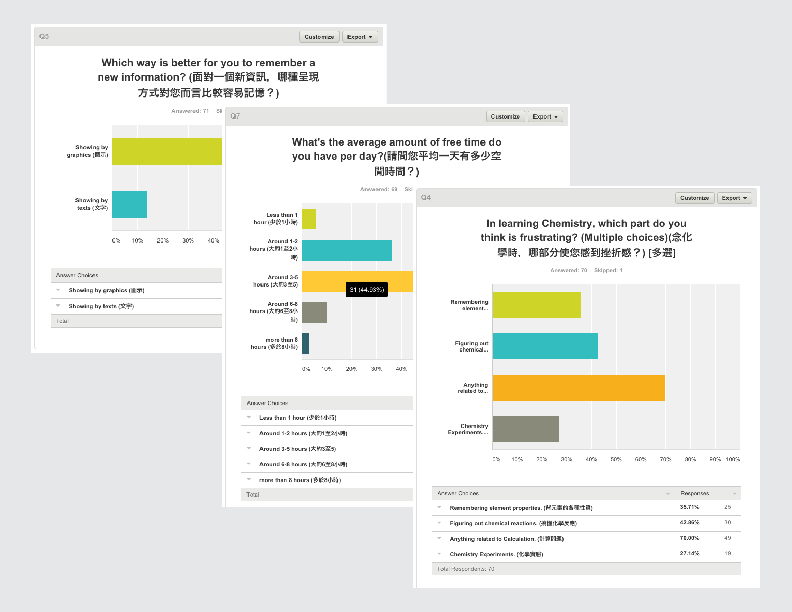
First, I choose my primary target audience to be the students at grade 6, when the periodic table is first introduced in the lecture. And then, I created some questionnaires to dig out the problems they have while learning. I also make surveys to help me get to know my target audience' habits and common life, so based on the survey, I get to decide what platform, features and interaction they need and want.
Interesting finding is the learning style! It seems that they prefer lecture contents with rich graphics better than plain texts. So Visual Learning comes to play!
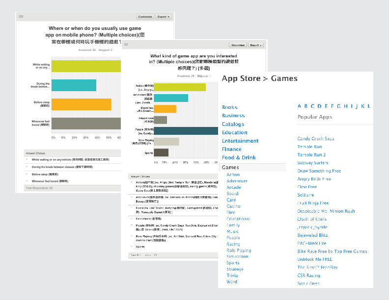
I made surveys to find out user's preference on game types and I also looked into app store to look for the pattern from popular game apps. Based on the data, users check on mobile phone whenever there's short time left, and they play social games to kill time and compete with others. Since young adults are usually lack of patience, the gameplay should be simple and addictive with flashy visual effects.
Arcade puzzle/action game seems to best match my insight of the project. Short time, instant reward, and competitive if combined with social media.
Middle School Students (6th-8th grade)
Elementary School Students (Ages 6-11)
Repeated brain-washing gameplay for memorizing the first 20 elements’ atomic numbers in periodic table!
Chemistry is about attraction and reaction, it's beautiful and interesting. But the learning process can be tough, which involves memorization along with comprehension. Chemie Pop is designed to improve the learning experience, and add fun to learning process.

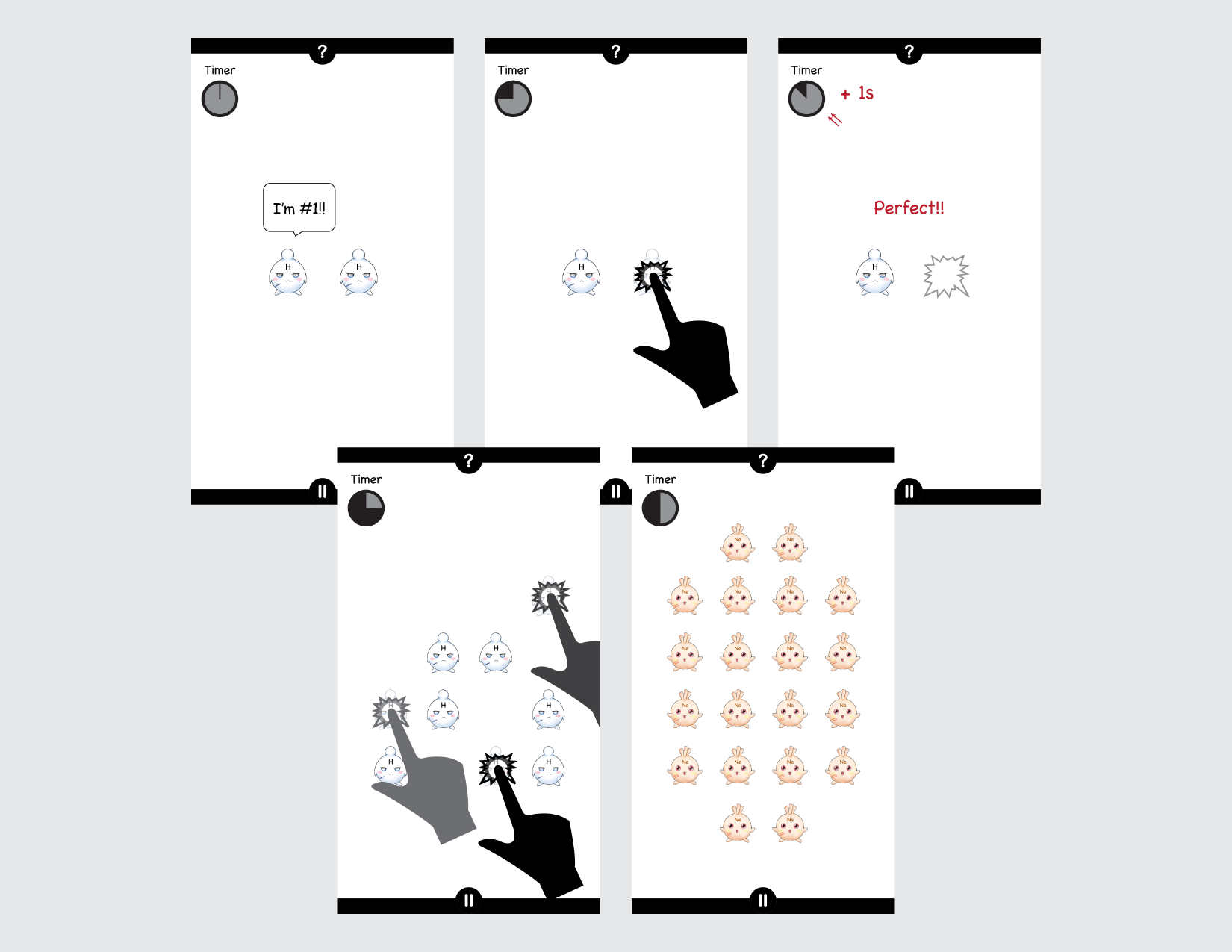
The key design point of gameplay is the interaction. And the purpose is to make users to repeatedly take the same action or recall their memories during the game, so that they unconsciously memorize the atomic number. I came up with two based on arcade gameplay design - tapping to match target number (time based) and move tiles to match target number (turn based).
While time based gameplay is more exciting, it has its limit of increasing targets on stage. It takes two user actions to complete one task, which seems not intuitive enough as an arcade action gameplay.
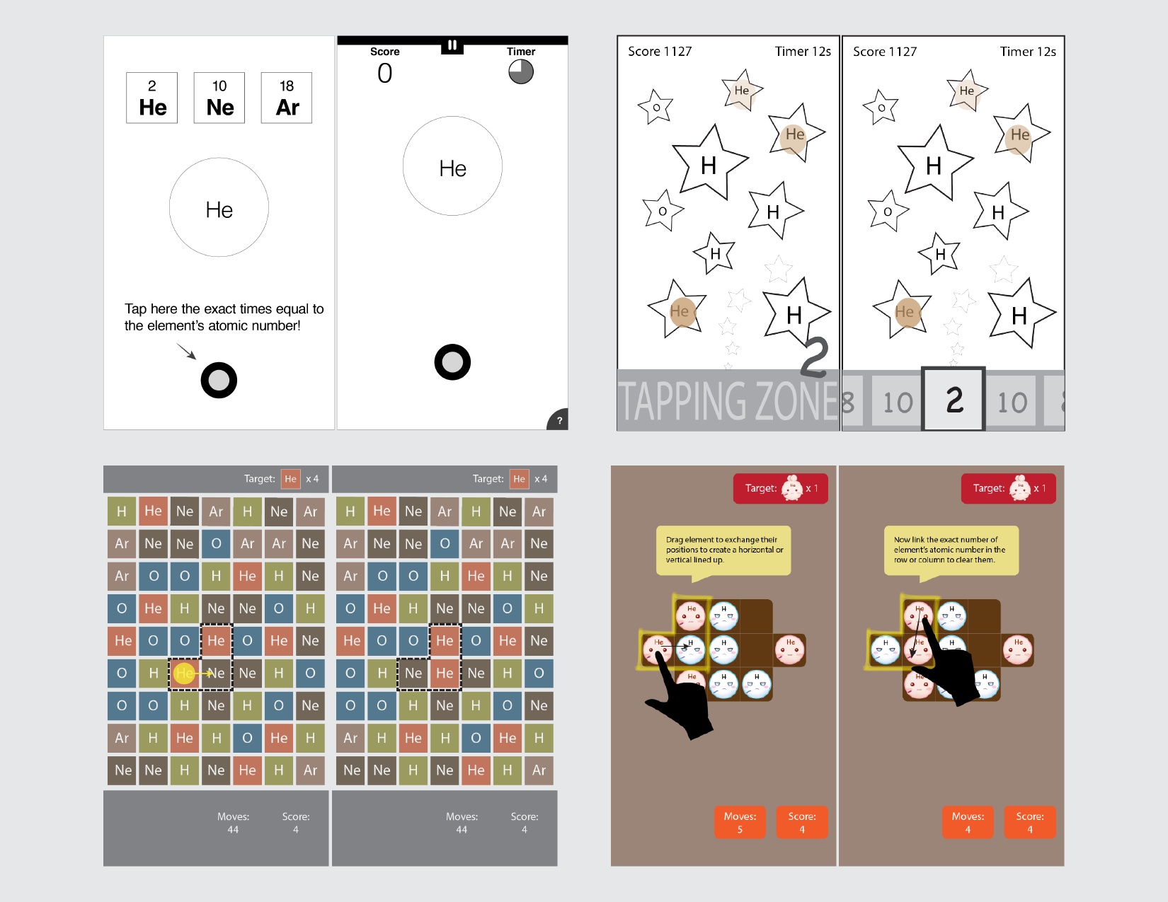
Tap on element to “kill” it so that the total amount of remaining elements on stage equals to target's atomic number.
Loss: Time is up
Victory: When player reaches level goal
Issue:
Tapping too many times might be annoying. Stage gets crowded when target's atomic number > 10.
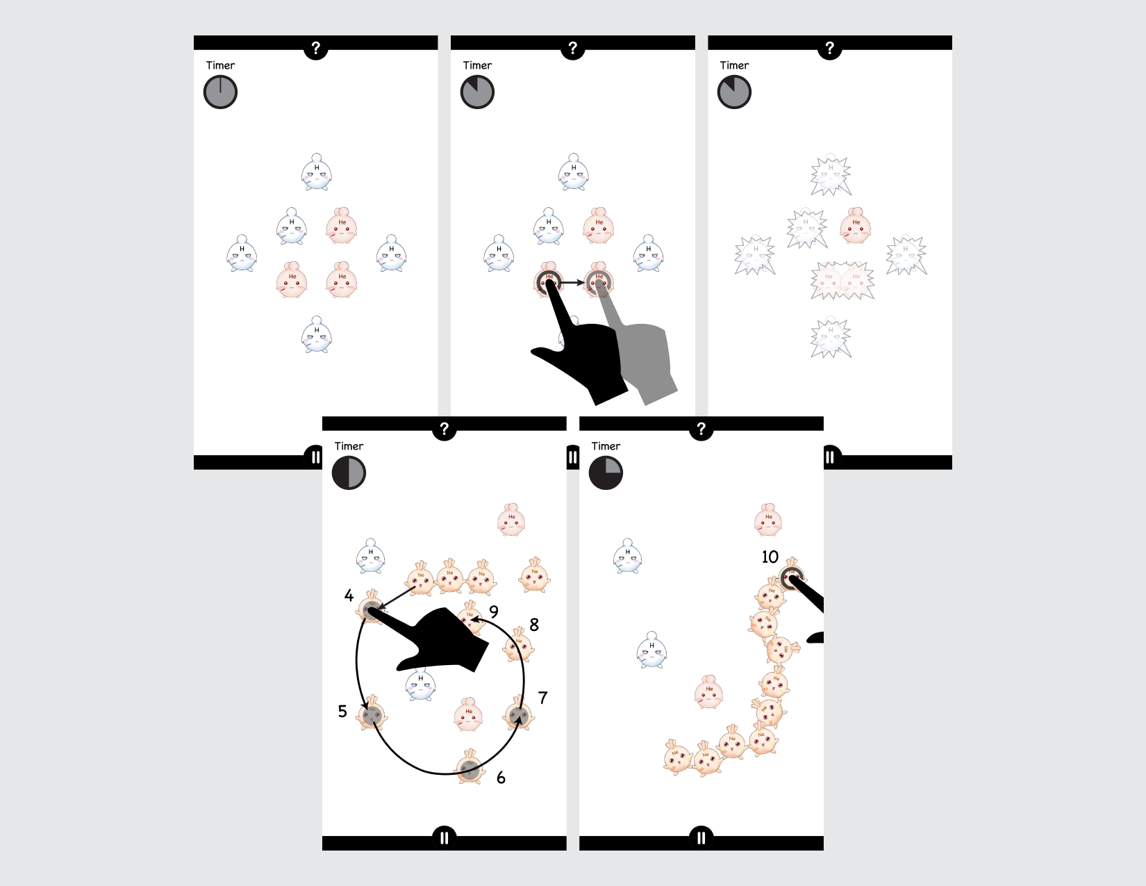
Connects elements together to make the linked number equals to it's atomic number.
Loss: Time is up
Victory: When player reaches level goal
Issue:
Element recognition is hard for new player. While multiple elements show on stage, user needs to choose a target to start, which might cause confusion.
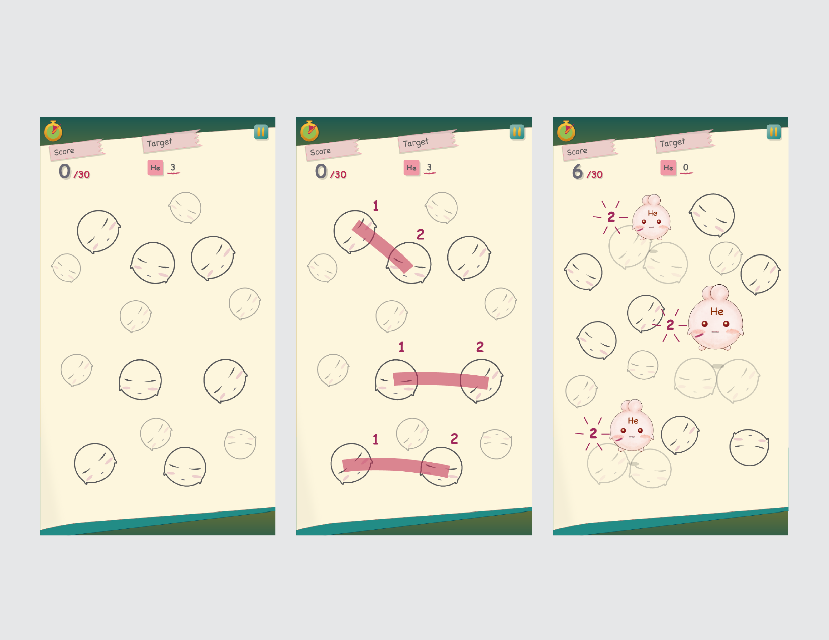
After thoroughly thinking, taking learning outcome and educational meaning into consideration, I finally defined the gameplay! Combine two gameplay concepts, keep the pros and refine the cons. Instead of letting user to choose target, make the game set the target! To avoid element recognition issue, create an object to generate all the elements! Here, PROTON plays the hero!
Proton:
The number of protons in the nucleus is the defining property of an element, and is referred to as the atomic number.
There will be 20 levels total in the game, each stands for one element from the first 20 elements in periodic table. A new element will be added as the random target when leveling up. Getting high score unlocks the character in Collections.
The First 20 elements:
Atomic number 1-20, many common substances are composed of atoms from these elements.
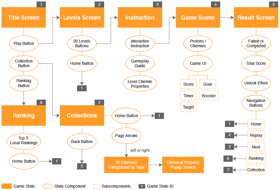
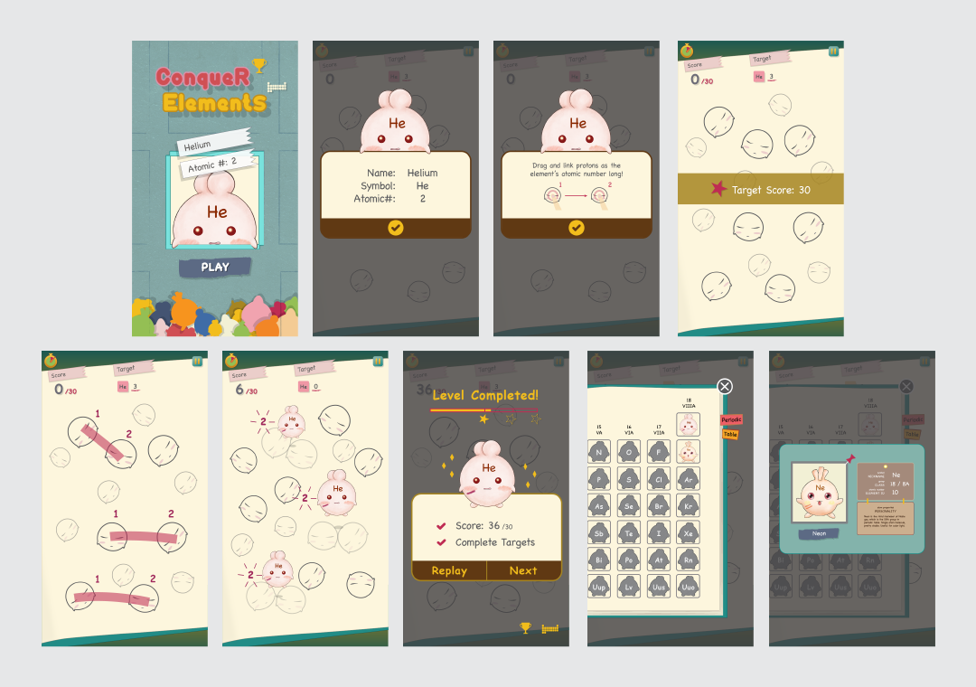

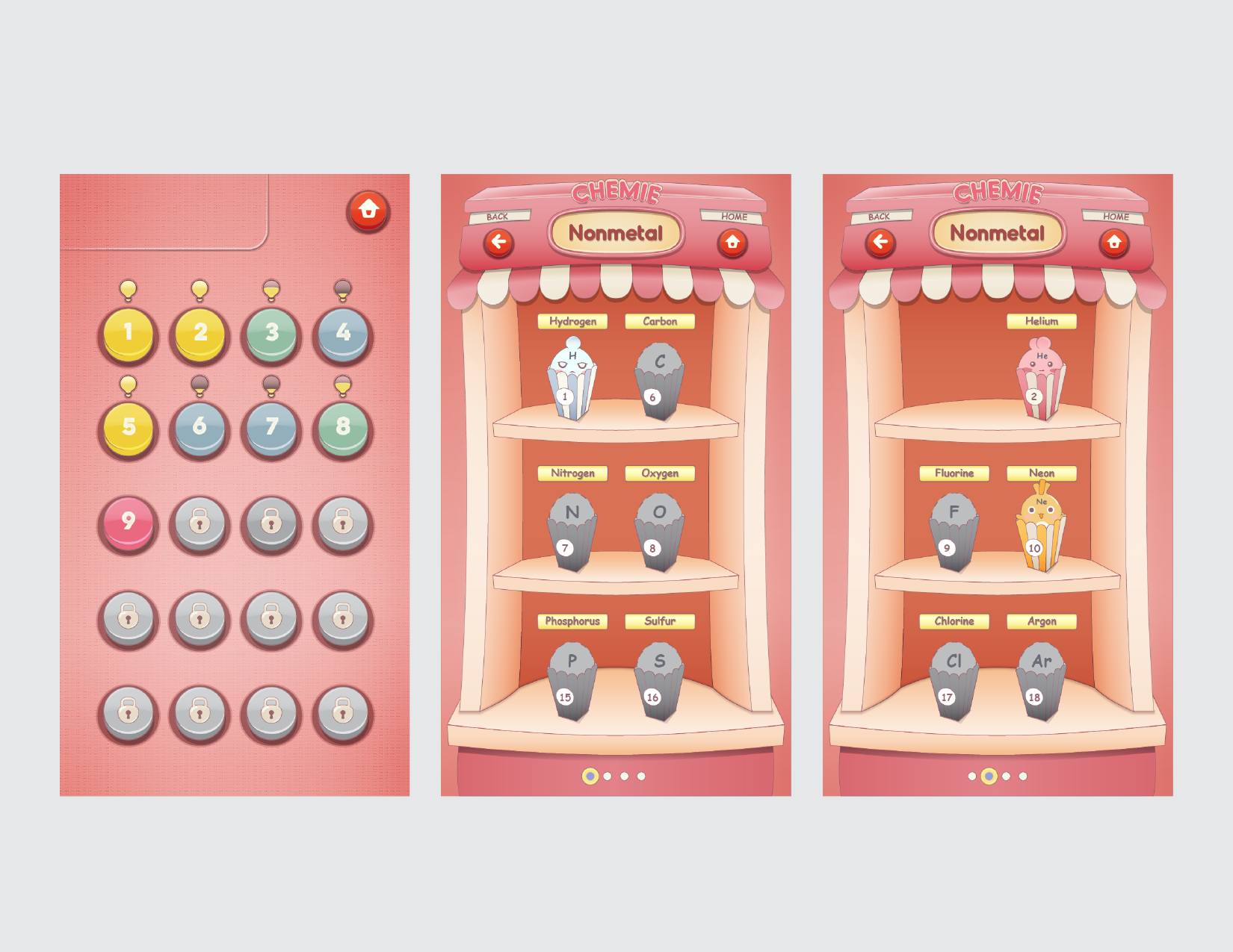
The original idea is to keep the game flow straight forward, so that users don't have to worry about which level they at and just focus on keeping leveling up. But during the user testing, I found out that most users would like to choose a level to start. It seems like letting the game to take over the whole control is a little overwhelming. Hence, I added the level menu, and keep records of user's score at each level. In this phase, I also changed the visual design for Collections section to make it better suit the scene and visual consistency.
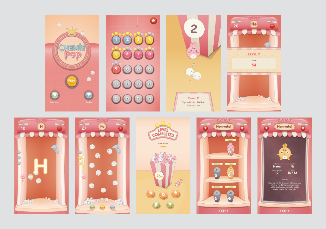
I came up with this idea to keep user engaging and playing. It's the same gameplay, but a chemie booster will shorten a proton link! User can take advantage of booster to create more “Chemie Pop” quickly. In the meantime, user get to recall the booster chemie’s atomic number again!
Combo: Keep creating "Chemie Pop" without mistake. When combos > 4, it fires booster function. 3 boosters at most can be fired with high combos.

Users are not really interested in long text. So I changed introduction text to animation, which drew attention but users still felt indifference. However, when it shows as a interactive instruction, users are forced to take action to keep the game going, so they pay attention and get to know the gameplay.
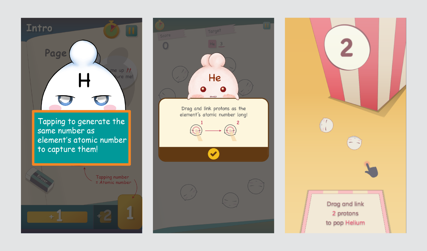
It's hard to tell whether a proton is connected or it is a free proton. In order to differentiate, I created an animation effect, which plays whenever a proton is linked. To show the current number of connected proton, I marked the number on the side of the link for user to check.
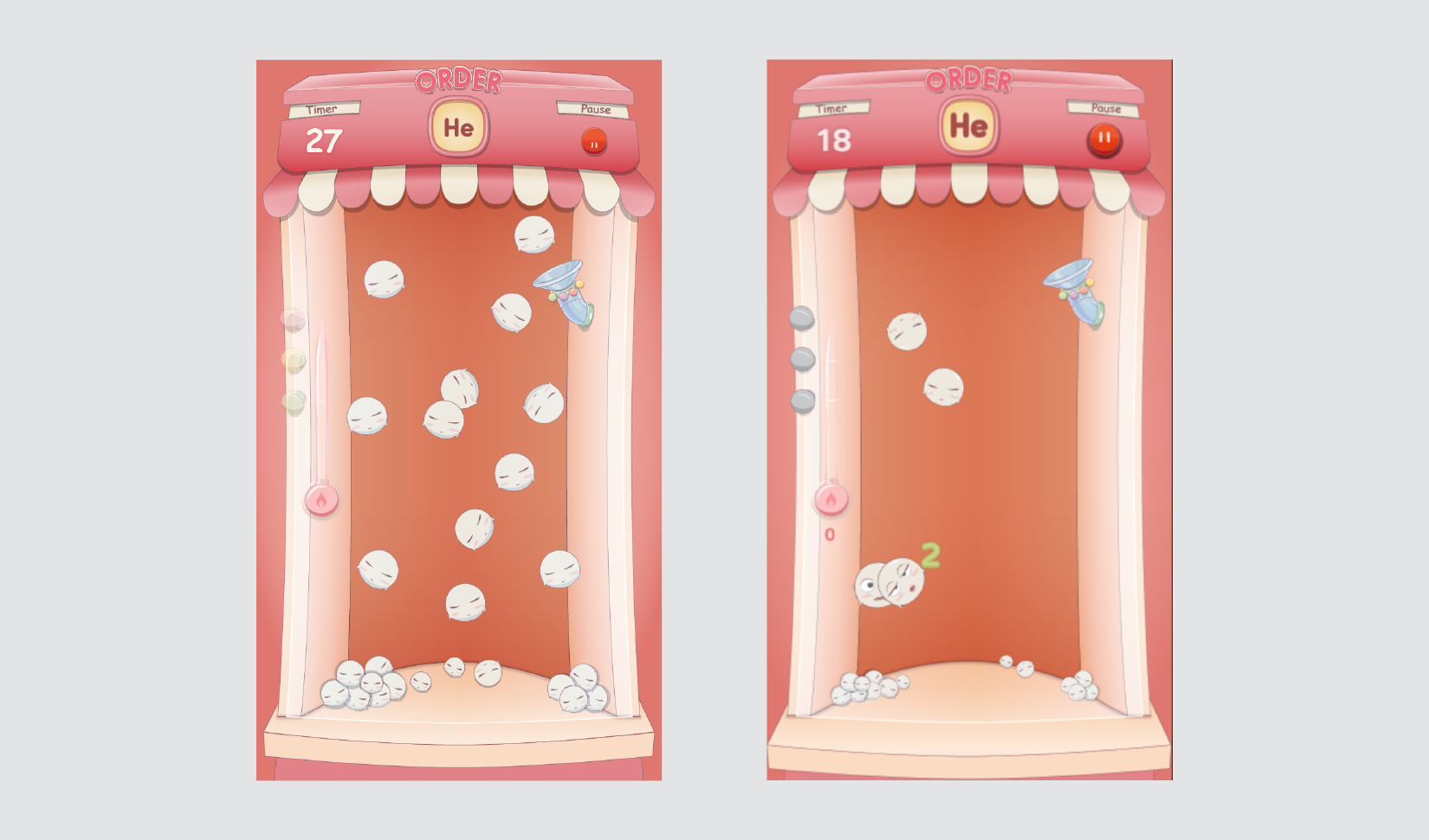
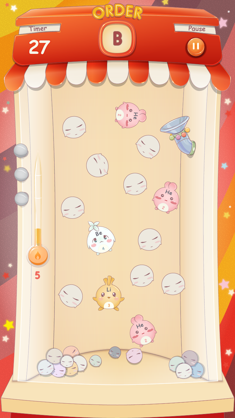
Chemies along with default protons show on stage randomly without user interaction.
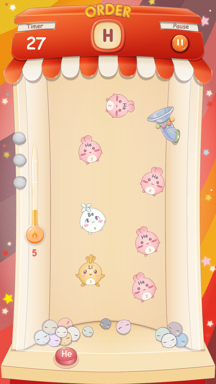
Chemies show on stage only through boosters which user gets through accumulated combos.
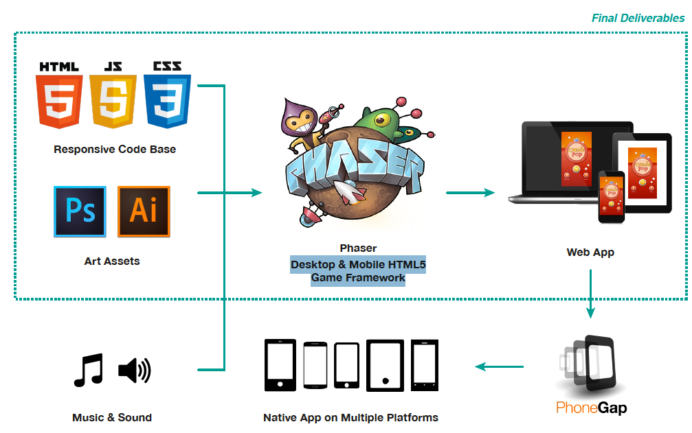
I use phaser to handle responsiveness and physics system. It provides various physics engines, including arcade for simple AABB physics system, and P2 for complete physics system.
For the next step, I will publish it as a native game app so that it has better performance on mobile devices.
As the user levels up, there are more and more elements added into the stage, and so as the random target. The default random function picks the number randomly, but I would like to pick the new element more often than the others, so that users can have more chance to practice the new one. Therefore, I wrote the weighted random function to pick the target, and it has more chance to pick the latest added elements.

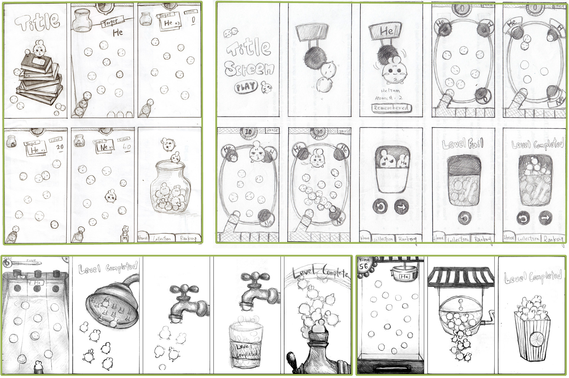

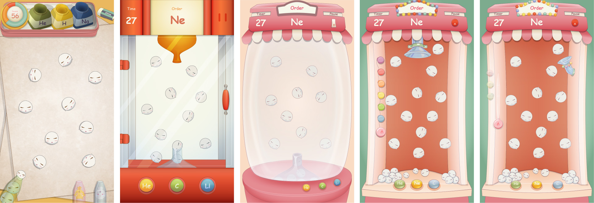


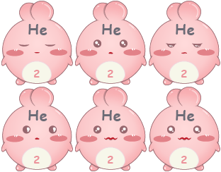




Chemie Pop is the most completed project that I have accomplished. Every little detail is taken care, including concept, project goal, user needs, visual communication, usability and technical plan. Looking back, so many changes I had made based on research and user testing. The key design point - gameplay and interaction have been modified and revised for several times! It took lots of brainstorming and research to finalize a meaningful and intuitive gameplay.
I also jumped out of the original visual design concept, and changed the theme and game title to make it more like a fun game that users want to engage. Throwing a idea is one thing, but to shape the idea and make it functional is totally another; it takes time and energy. Thanks for it, I gained so many skills needed as a designer, including concept developing, wireframes, user testing principles, illustration, game development, and the most important, being detailed and patient.
Best viewed with any desktop browsers, and iPhone web app mode.
On iPhone Safari, use “Add to Home Screen” to launch.
