the Counter Burger
Website Redesign (PHP + MySQL)
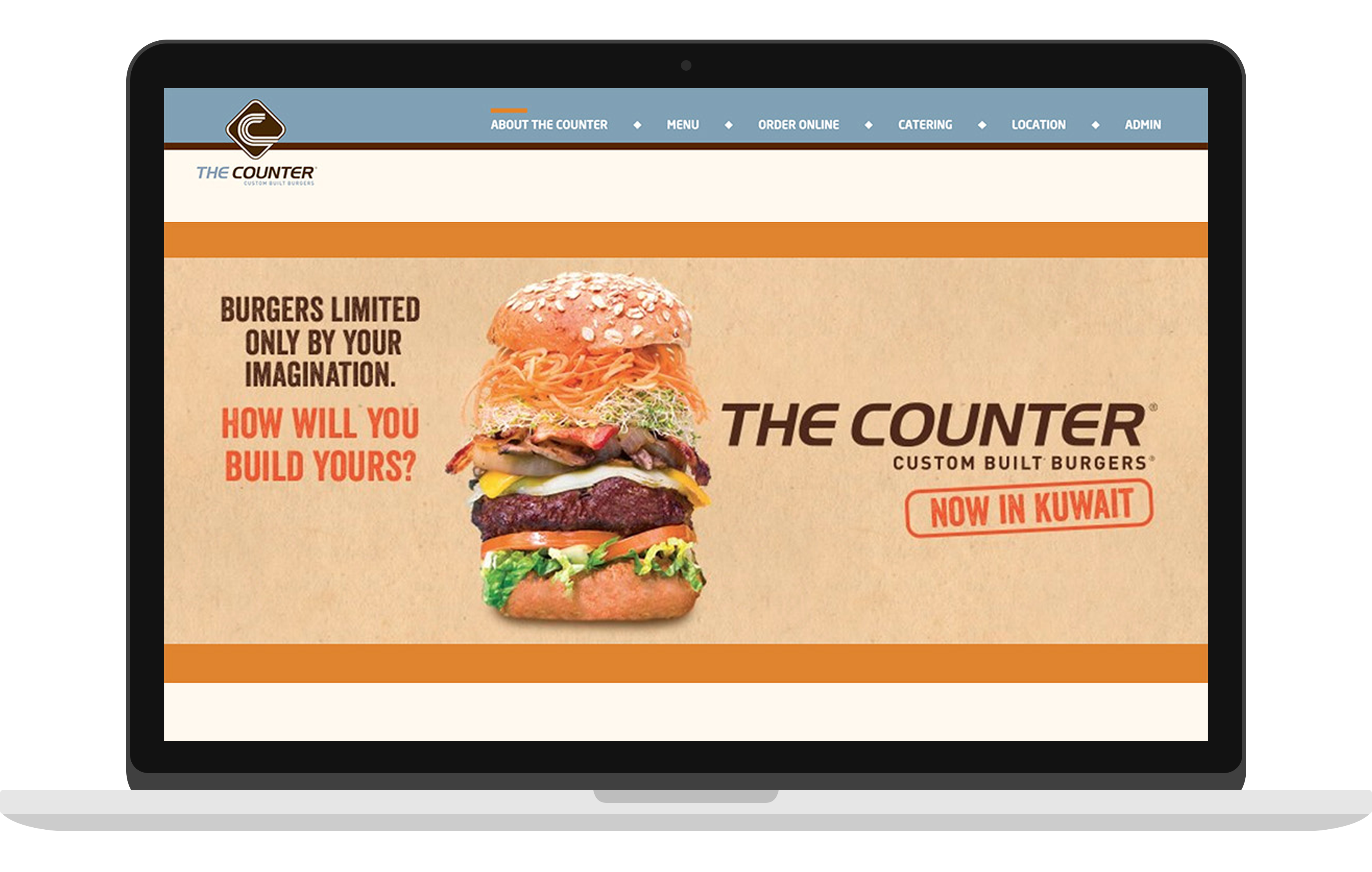
Website Redesign (PHP + MySQL)

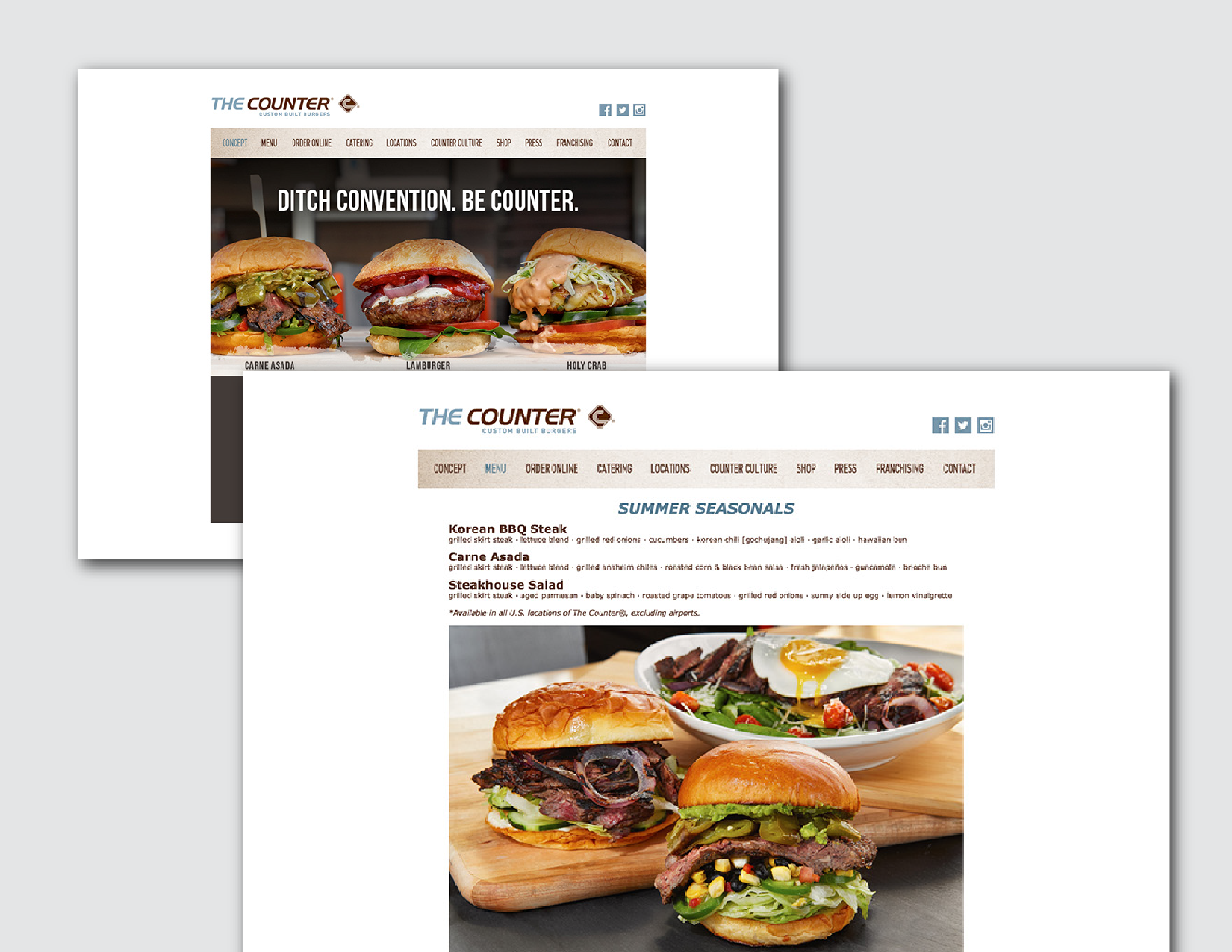
I love the Counter Burger, their photos on instagram are so appealing, but the website? uh... especially the menu page Orz So I tried to redesign their website, and focus on landing page and menu page. I actually build the mySQL database for the menu (that is a lot!)
Randomly picks a task for you in just ONE tap!
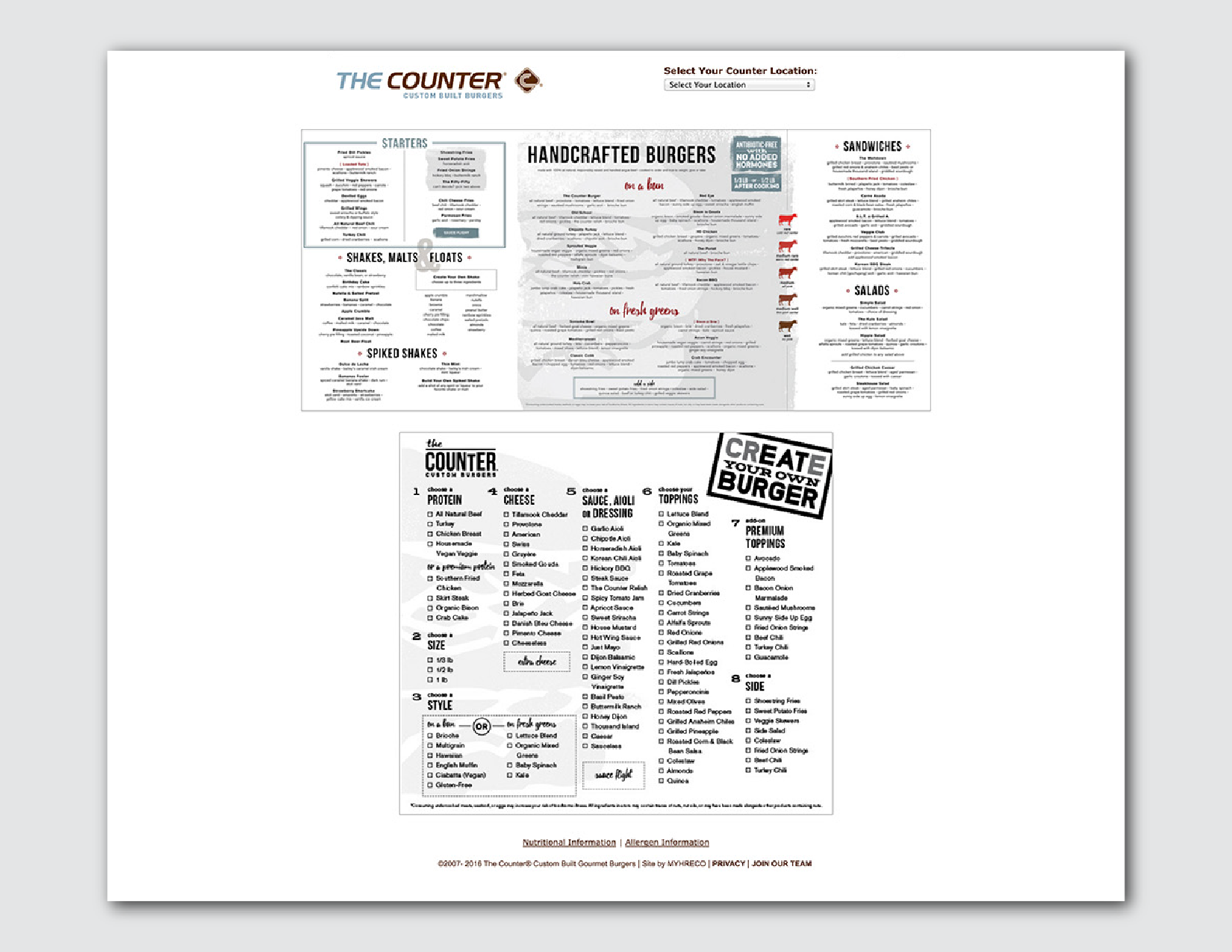
Trowing the whole pdf file on the page, lack of readability and no way to search.
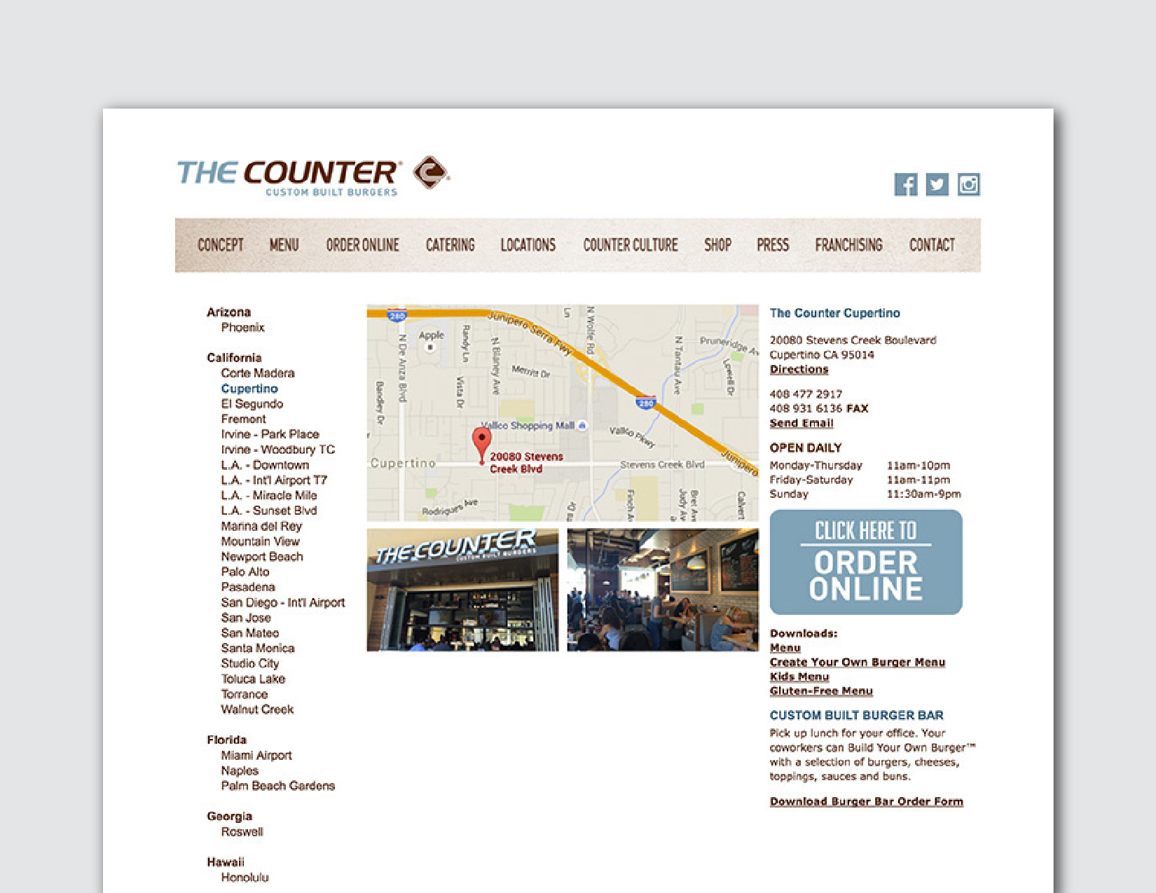
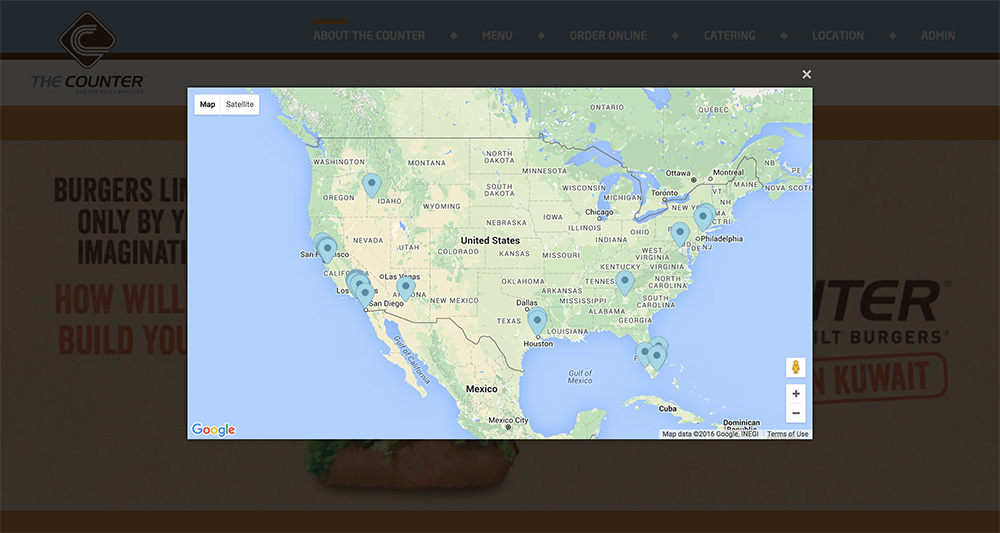
They put a screenshot from the map on the page, no way to zoom in/out to see the near by and interact with it. Besides, a long location list at the left column of the page causes too much dead space.
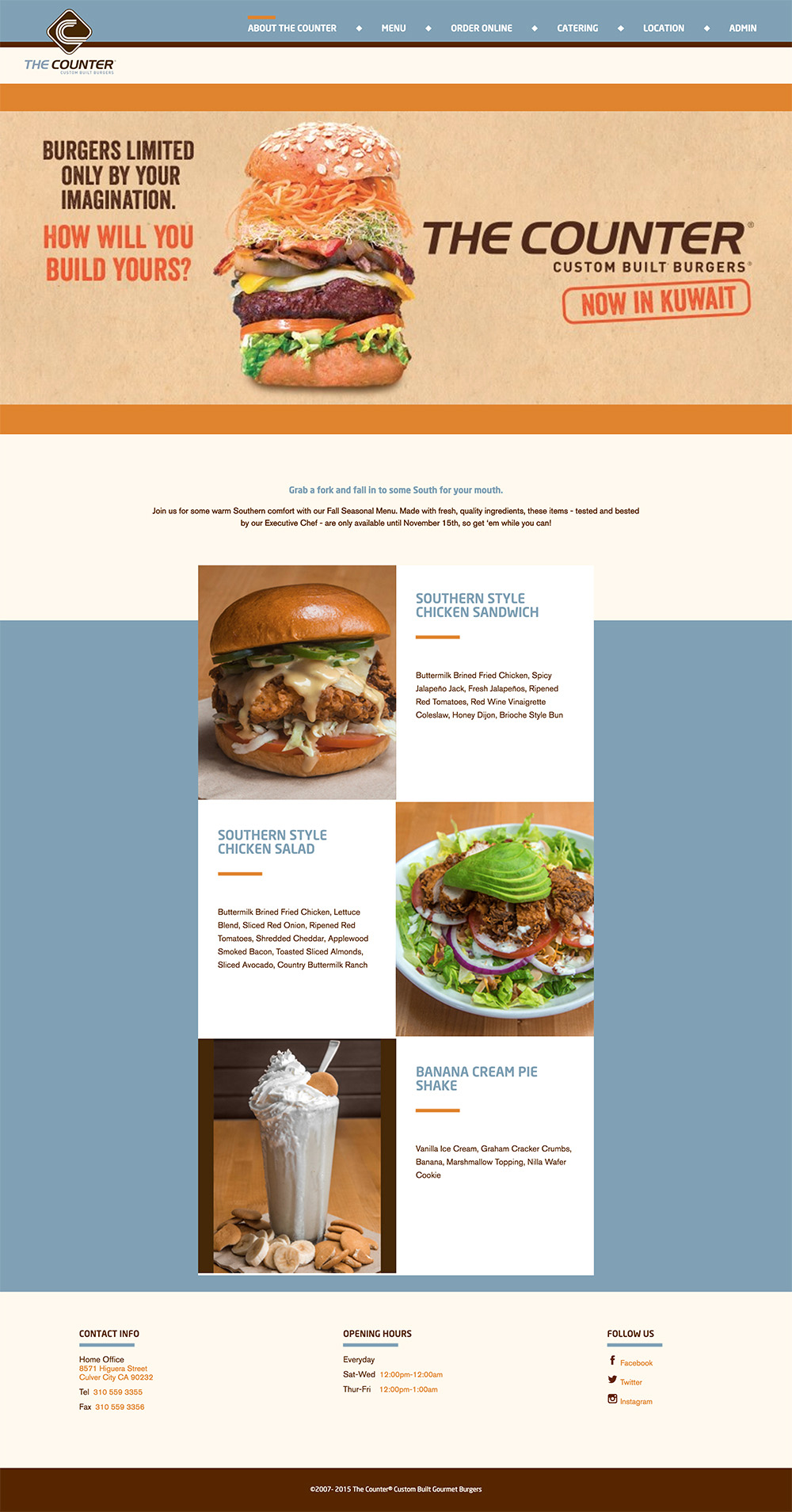
Instead of static images, put big slideshow to catch eyes!
Below the slideshow introduces the counter's feature foods. and restaurant contact information.
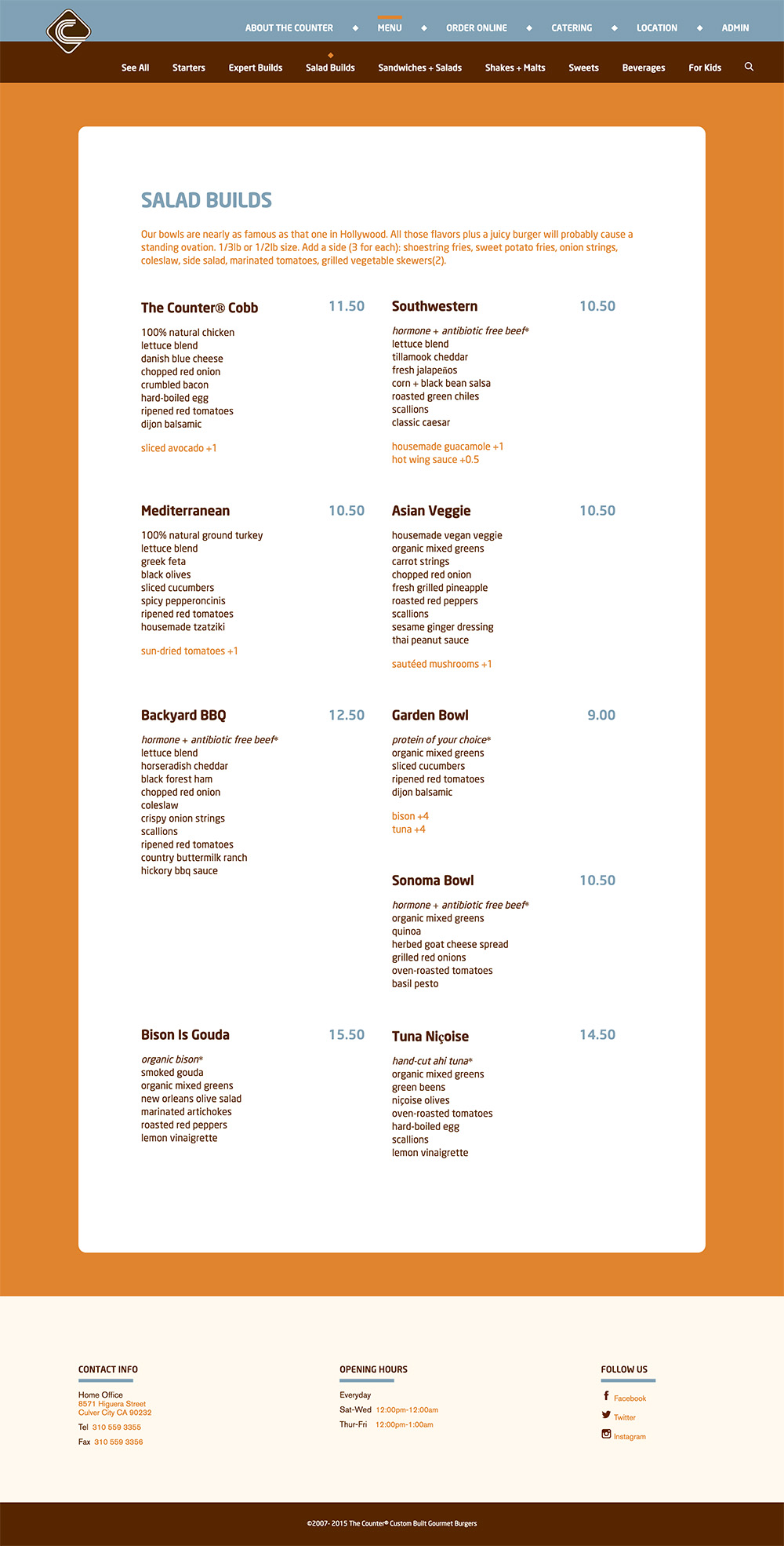
The original menu page is a scanned image. Viewers have to zoom in to see detail. Moreover, there's no way to search the menu. Therefore, I build database to store hundreds of menu items, so now users can view menu by categories and also search the key words.
For restaurant website, it's better to have attractive photos to show the food. I thought about using item photos to show the menu, but since there are lots of items(costumed meal) on the menu, it's hard to have photos of every single item. Hence, here I use text title. May think about photos for category and signature food, or create a section for food image gallery.
Embed google map to show the Counter Burgers around the world! The prototype isn't completed. Ideally, there should be a front page showing all the locations with a map aside, which will responds to user's click on each location
Best viewed with desktop browsers.
View prototype